The Psychology of Color in Design
The Psychology of Color in Design-

Color psychology is the study of how different colors can affect people's moods, behaviors, and perceptions. Certain colors can evoke specific emotions and feelings in people, such as blue being associated with calmness and trust, red with passion and excitement, and yellow with happiness and optimism. These associations can vary based on cultural, personal, and contextual factors.
Color harmony refers to the way colors are combined in a design. There
are various color harmonies, such as monochromatic, analogous,
complementary, and triadic. A monochromatic color scheme uses shades and
tints of a single color,
Color theory is the foundation of color psychology in design. It is the study of how colors work together and how they can be used to create aesthetically pleasing and effective designs. Color theory includes concepts such as color wheel, color harmony, color contrast, and color temperature.
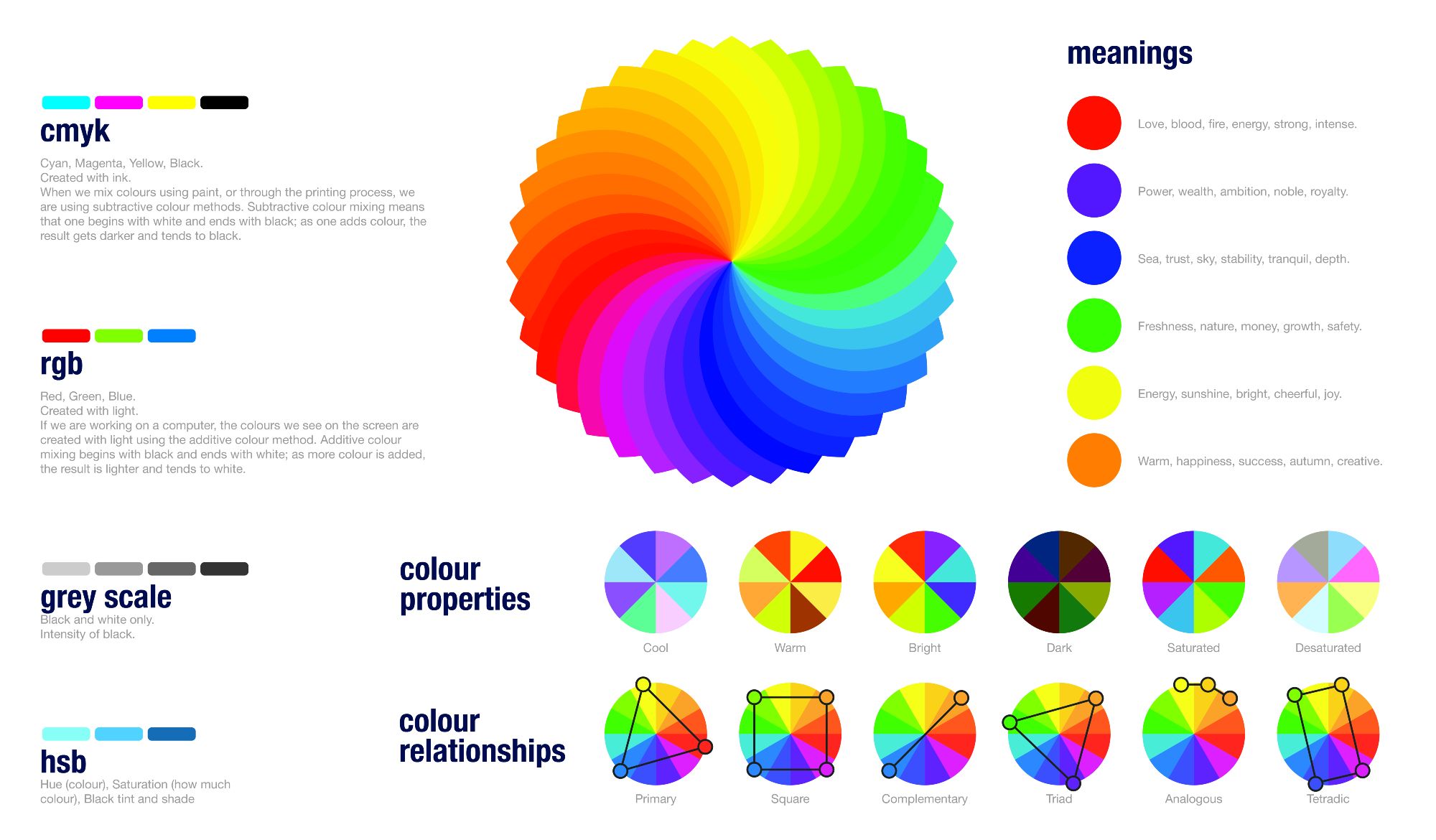
Color temperature refers to the perceived warmth or coolness of a color. Warm colors, such as red, orange, and yellow, are associated with energy and excitement, while cool colors, such as blue, green, and purple, are associated with calmness and relaxation.
Color contrast is the difference between two or more colors used in a design. Contrast can be used to create visual interest and hierarchy. High contrast, such as black and white, creates a strong visual impact, while low contrast, such as pastel colors, creates a subtle and calm effect.
A complementary color scheme combines colors that are opposite each
other on the color wheel, while a triadic color scheme uses three colors
that are evenly spaced on the color wheel.
In conclusion, the psychology of color in design is a complex and
fascinating field that involves understanding how different colors can
influence human behavior and emotion.


Comments
Post a Comment